


This article has been excerpted from book "A Programmer's Guide to ADO.NET in C#".
DataGrid control is one of the most powerful Web controls. By using just a DataGrid control, you can write full-fledged Web applications for your Web site in this section, you'll learn all about the Data Grid methods and properties. The following examples are heavily based on this control.
You can use a DataGrid control to display tabular data. It also provides the ability to insert, update, sort, and scroll the data. Using and binding a Data Grid is ability to insert, update, sort, and scroll the data. Using and binding a Data Grid is easy with the help of the ADO.NET datasets. This grid is capable of auto generating the columns and rows depending on which data you're connecting.
Another control worth mentioning is the DataList control. A DataList control provides a list view of the data from the data source. These controls work similarly.
DataGrid and DataList controls have similar properties. Table 7-5 describes some of the common DataGrid properties.
Table 7-5. Data Grid Control Properties
PROPERTY | DESCRIPTION |
Allowpaging, AllowCustomPaging | Boolean values indicate whether paging or custom paging is allowed in the grid. Syntax: AllowPaging ="true" |
AllowSorting | Boolean value indicates whether sorting is allowed in the grid. Syntax: AllowSorting ="true" |
AutoGenerateColumns | Gets or Sets a value that indicates whether column will automatically be creates for each bound data field. Syntax: AutoGenerateColumns ="true" |
BackColor, ForeColor, Font | Sets the background color, foreground color, and font of the grid controlSyntax: BorderColor ="black"; ForeColor = "green"; Font-Name ="Verdana"; Font size ="10pt" |
BackImageUrl | Gets or sets the URL of an Image to display in the background of the DataGrid. |
BorderColor, BorderStyle, Borderwidth | Sets the border properties of the control. Syntax: BorderColor ="black"; BorderWidth ="1" |
CellPadding, CellSpacing | Sets the cell spacing and padding. Syntax: CellPadding = "10"; CellSpacing ="5" |
Columns | Gets a collection of column controls in the DataGrid. |
CurrentPageIndex | Index of the currently displayed page. |
DataKeyField | Primary Key field in the data source. |
DataSource | Fills the grid with the data. Syntax: DataGrid1.DataSource = ds.Tables["Student"].DefaultView; |
EditorItemIndex | Index of the item to be edited. |
EditItemStyle | Style of the item to be edited. |
HeaderStyle, FooterStyle | Header and footer styles. Syntax: HeaderStyleBackColor ="#00aaaa"; FooterStyleBackColor="#00aaaa" |
GridLines | Gets or sets the grid line style. Syntax: Grid Lines ="vertical" |
Height, Width | Width and height of the control. |
ID | ID of the control. |
Page | Returns the page object that contains the current control. Syntax: Page.DataBind(); |
PageCount, PageSize | Returns the total number of pages and number of item in a page to be displayed. Syntax: NumPages = ItemGrid.PageCount;Items=ItemGrid.PageCount |
SelectedIndex | Index of the currently selected item. |
SelectedItem | Returns the selected item in the DataGrid. |
ShowFooter, ShowHeader | Show header and footer. Syntax: ShowFooter ="true";; ShowHeader="true"; |
UniqueID | Returns the Unique ID for a control. |
VirtualItemCount | Total Number of items on the page When AllowCustomerPaging is true. |
Setting DataGrid Control Properties at Design-Time
In VS .NET you can set the DataGrid control's properties at design-time by right-clicking on the control and selecting the properties menu item. This displays the Properties window (see figure 7-23).
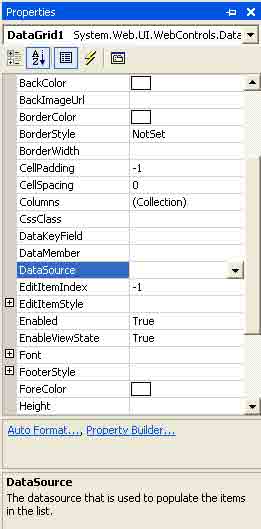
Figure 7-23. Data Grid properties
Most of these properties should look familiar to you by now. You can set the DataSource property to a data view, dataset, data view manager, or a data reader. The DataMember property represents a column of a data table if you want to display only one column in the control.
AutoFormat
Besides the general properties of a datagrid, in figure 7-23, you see two links: Auto Format and property Builder. The Auto Format option provides you with predefined formats for rows, columns, headers, footers, and so on (see Figure 7-24).
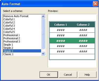
Figure 7-24. DataGrid's Auto Format dialog box
PropertyBuilder
The property Builder option launches the properties dialog box. The first property page is general, as shown in Figure 7-25. This page lets you set a DataSource name at design-time, For Example if you have a DataView control, you can set it as the DataSource property of a grid.
If you want to add headers and footers to the DataGrid control, you can set them by checking the show Header and show Footer check boxes on this page. The Allow Sorting check box enables sorting in a Data Grid control.
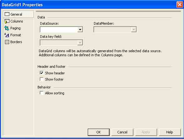
Figure 7-25. Data Grid general properties
Column Property page
By default, DataGrid control adds columns at run-time depending upon the DataSource property of the grid. By using the Column property page, you can add DataGrid columns at design-time by unchecking the create Columns Automatically at Run Time check box (see figure 7-26).
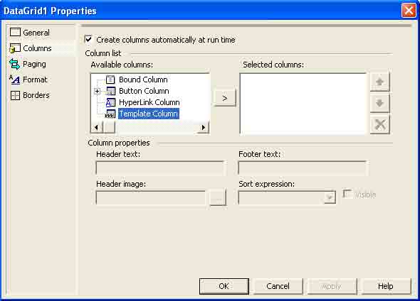
Figure 7-26. Data Grid Columns properties page
As you can see in figure 7-26, you even add Data Grid columns as a button a hyperlink, or a template column.
Paging property Page
The paging property page enables the paging feature in the grid control. In other words, this feature allows you to set the number of records displayed per page in a data grid control. For example, if a data grid control has 50 records and you set page size to 10, the data grid will show all 50 records in five pages. The paging property page also allows you to navigate to the first page, next page, previous page, last page, and even to particular page number by selecting the mode of Navigation for navigating pages. You can either display links to the previous and next pages or display specific page numbers (see figure 7-27).
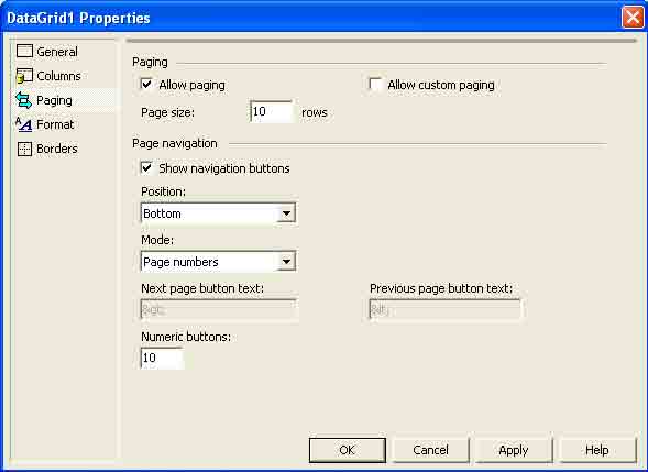
Figure 7-27. DataGrid paging properties page 8
Format property Page
If you don't want to use the Auto Format option, you can use the Format page. This page enables you to set the color and font of a DataGrid control. In fact, you can set the color and the font of the entire grid, headers, footers, and pages (see Figure 7-28).
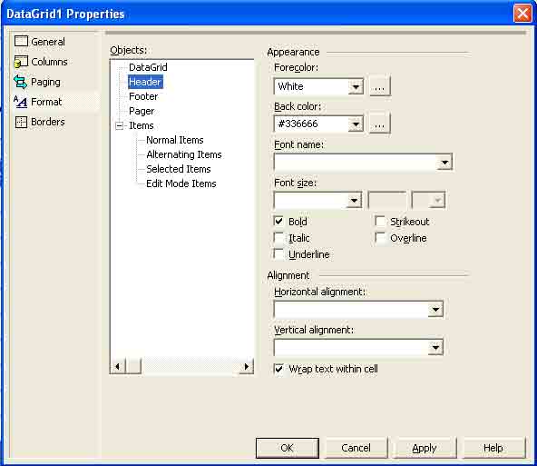
Figure 7-28. Data Grid Format properties page
Borders property page
The Borders page enables you to set the border, color, font, cell padding and spacing, and type of lines in the Grid (see figure 7-29).
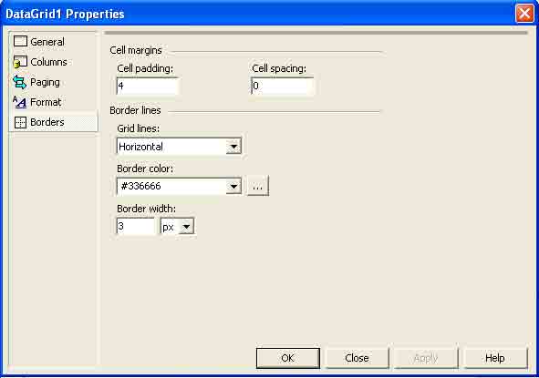
Figure 7-29. DataGrid Border properties page
You'll see how these properties in the sample applications throughout this article.
Binding Web Forms Controls at Design-Time
In the "Developing your first ADO .NET Application" section, you saw how to bind data to Web Forms controls (ListBox and DataGrid, specifically) at run-time Similar to Windows Forms, Web Forms also support design-time data binding. Design-time data binding helps you develop database applications with writing a few lines of code.
Binding data-bound controls at design-time using data adapters and other ADO.NET components is easy. There are many ways to create data adapters at design-time.
In this sample application, you're going to use the Data Adapter Configuration Wizard to create a data adapter. In this example, like always, I'll use the North wind Access 2000 database and the OleDb data provider.
Conclusion
Hope this article would have helped you in understanding DataGrid and Data list Controls in ASP.NET. See other articles on the website also for further reference.
 | This essential |
0 comments:
Post a Comment